Design system project
A scalable and unified design system built to streamline our TMS platform, ensuring consistency, efficiency, and a seamless user experience across all logistics operations.
Role
UX/UI Designer
Platform
Logistics & Transport
Duration
4 months
Tool
Figma

Project Overview
Overview: Fretron Design System is a UI design framework we created to bring consistency and speed to our product design process. It was inspired by the Shipitwright UI kit from the Figma Community, which helped us get a clear idea of structure and style.
Nah, We didn’t just copy it — instead, we learned from it and built our own system step by step using a design system course. This helped us create components, styles, and patterns that fit Fretron’s needs and made handoff to developers easier and cleaner.
Problem Statement: Our TMS had inconsistent UI patterns, making it difficult for users to navigate and for developers to maintain. These are the main challenges that we have to tackle:
Our TMS grew without a consistent design, so screens looked different, workflows were confusing, and updating the UI sometimes caused issues.
Each group had different needs-dispatchers wanted detailed tracking, fleet managers need insights, so building a simple system for all was a challenge.
Engineering team used to work without design guidelines, so introducing a new system required training and convincing them of its long-term benefits.
My Role & Goals
My Role – I was involved from starting to end from selection to implementation, my role includes the following:
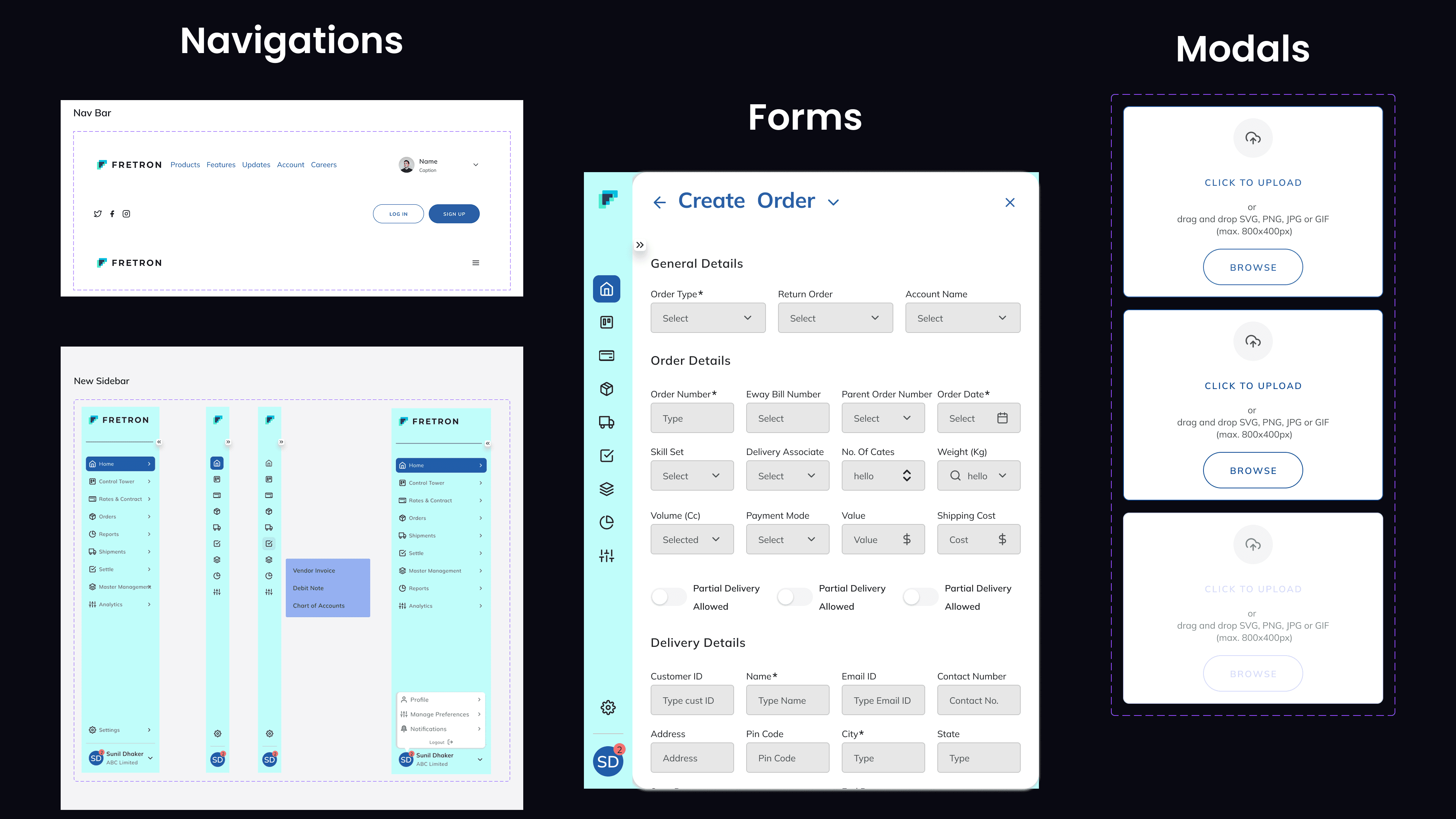
Refined colors, spacing, and typography to align with the product’s branding and requirements. | Applied custom settings and added necessary components to maintain consistency and meet design goals. | Developed advanced components such as Cards, Graphs, and Navigation to enhance functionality and user experience. |
Goals –
Establish a Unified and Consistent Design System
Design for Diverse User Needs
Enable Scalable Design-Engineering Collaboration
Design System Breakdown
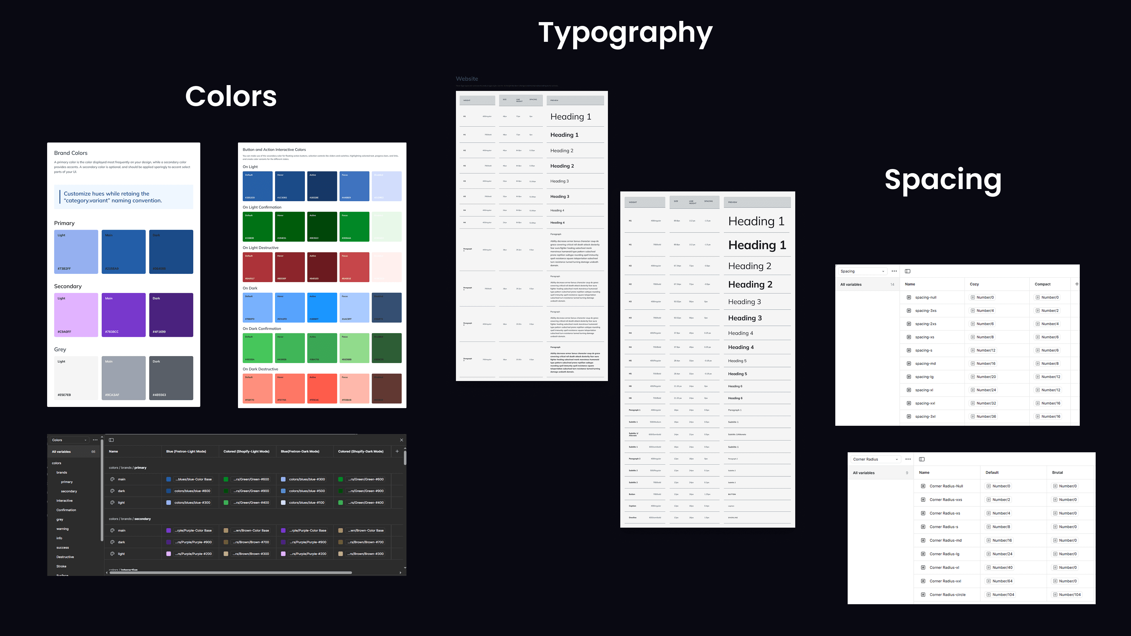
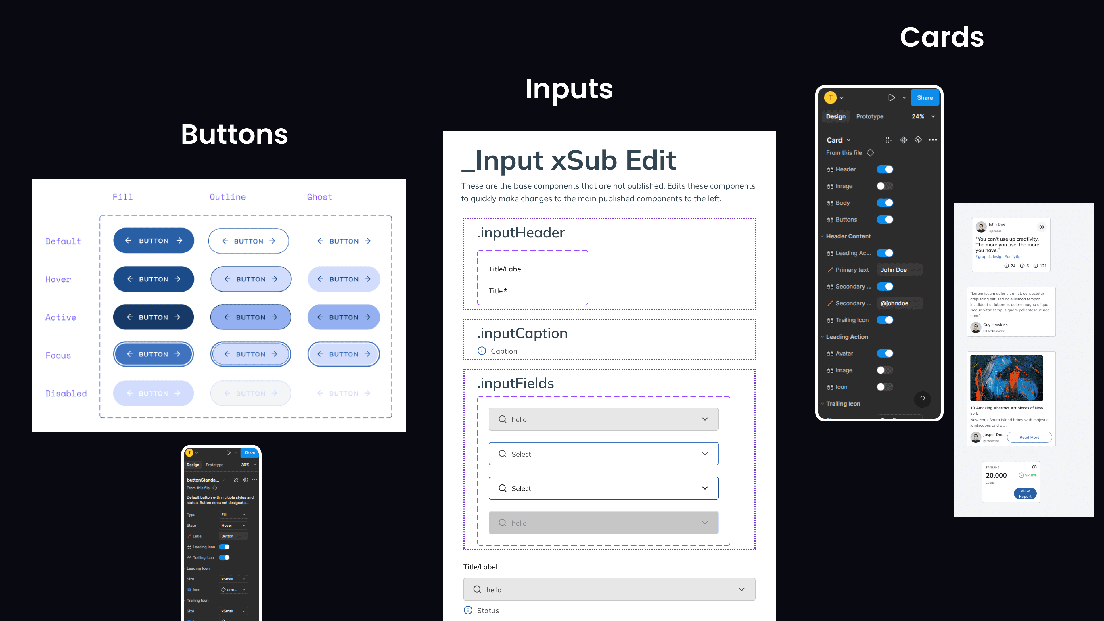
To maintain consistency and speed across teams, we built a custom design system — inspired by Shipitwright and tailored to Fretron's workflows. It includes reusable tokens, components, and real-world UI patterns.
Foundations:
Components:
Patterns:
Integration Process
Token System Implementation: We used a centralized token file for colors, typography, spacing, and shadows. Tokens were named semantically (
primary-bg,text-muted,padding-sm) instead of by value.Theming & Scalability: Built the system with light and dark themes in mind — all tokens and components are theme-ready. It is easily scalable for partner/white-label versions.
Component Structure Using Variants: Each component (like Button, Input, Card) was created using Figma Variants with props and ensure Auto-layout in all components:
Button →
Type: Primary/Secondary,State: Default/Hover/Disabled,Size: SM/MD/LGInput →
Type: Text/Password,State: Error/Success/Focused
Design to Dev Handoff: Integrated Figma Dev Mode with clearly defined component boundaries and documentation that will allow dev to directly copy the code and paste it in their system.
Results
We developed a modular design system with:
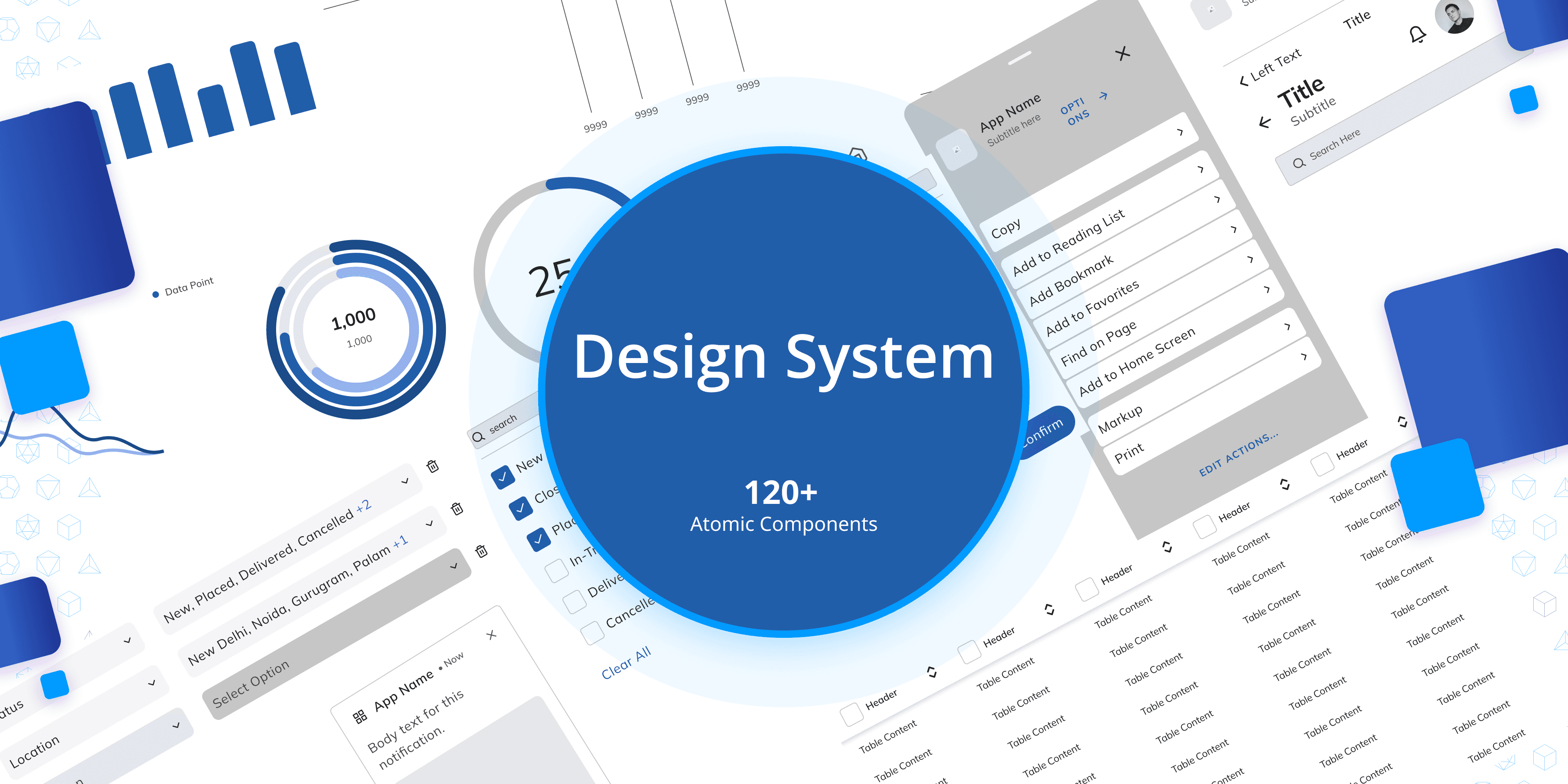
Component Library: Standardized buttons, forms, tables, and data visualization components.
Design Tokens: Unified typography, colors, spacing, and accessibility guidelines.
Design Documentation: A single source of truth for designers and developers, improving collaboration.


Challenges & Solutions
We faced some challenges since this was our first time building a design system, but we chose to find solutions and learn along the way. I can’t list them all, but here are a few major ones:
Challenges | Solutions |
|---|---|
Inconsistent UI Across Teams-Different teams were using mismatched colors, fonts, and components | we built a shared design system in Figma with proper tokens, styles, and reusable components — so everyone followed the same design rules. |
Too Many Versions, Not Developer-Friendly-There were multiple versions of the same components and developers were hardcoding styles | We solved this by using Figma Variants to clean up components so devs had accurate, ready-to-use values. |
Slow Updates and Legacy UI Issues-Updating old components took time and older screens couldn’t be changed immediately | We used Auto Layout to make components easier to maintain and applied a gradual update plan — starting with new screens and slowly improving the old ones. |
Other projects
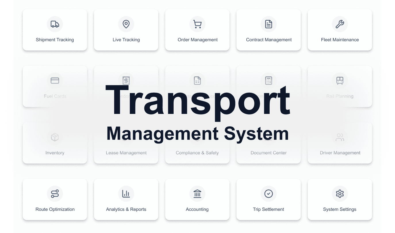
TMS Platform 2.0
TMS Platform Modernization - Redesigning and Adding new Features in Enterprise Logistics Software for 50+ Clients

Plant Management System
Designing a real-time system to track, categorize, and visualize vehicle movement within the plant, optimizing space utilization and resource allocation.

Intelligence Dashboard
Designing a unified system to track, analyze, and optimize plant logistics operations in real time.

ECG App
An ECG interpretation app built for practitioners and cardiovascular professionals. Designed to support accurate, efficient, and expert-level diagnosis in daily clinical practice.

Womeyn
A platform by women, for women. Womeyn supports women-led businesses through a socially-driven eCommerce ecosystem. Empowering women through community, commerce, and economic independence.